I Broke Ad School, A 100% free online ad school made for developing countries. The project has grown to about 16000 people organically, and some of the absolute biggest names and companies in the world have attached themselves to the project including UnCommon, Mischief, Liquid Death and more.
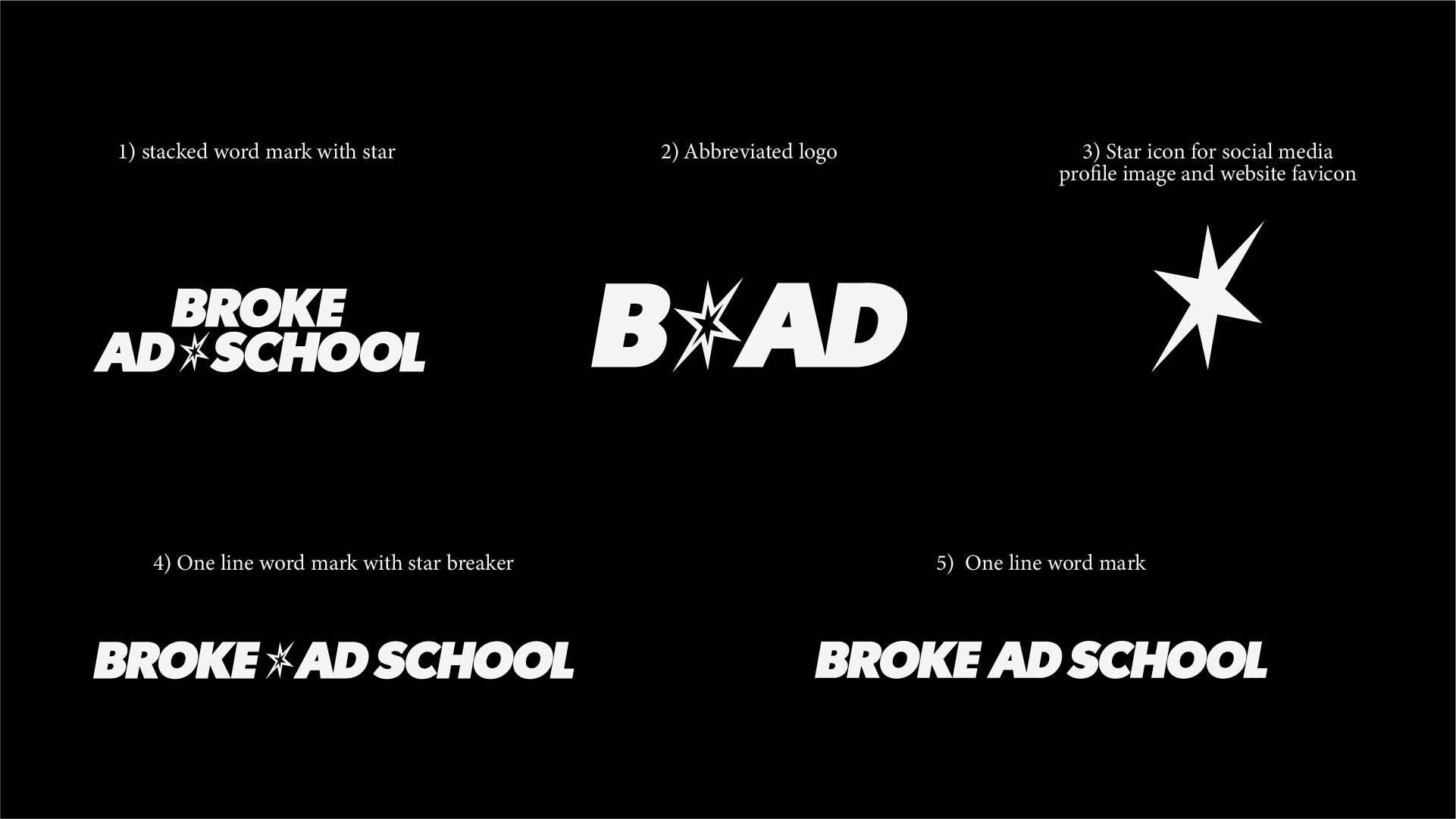
Because Broke Ad School’s primary focus is on young people from developing countries, the overall rebrand draws its inspiration directly from them. The new logo mark represents the continents home to these developing regions, with the star symbol reflecting a common emblem of independence found on many national flags across Africa, South America, and Asia.
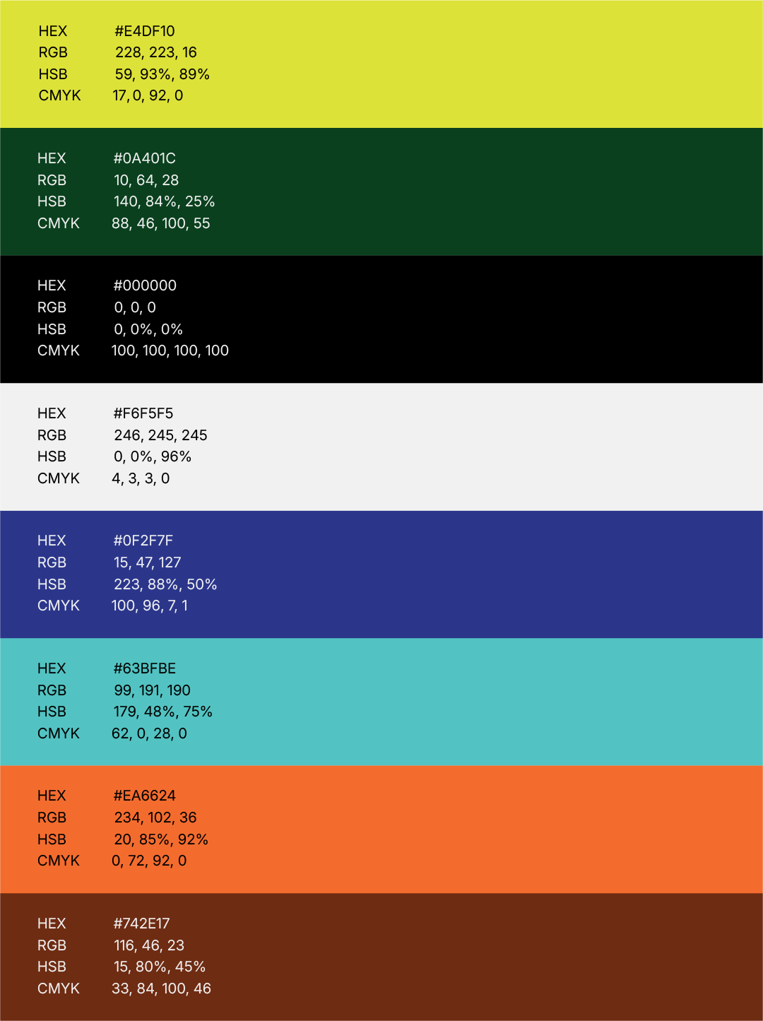
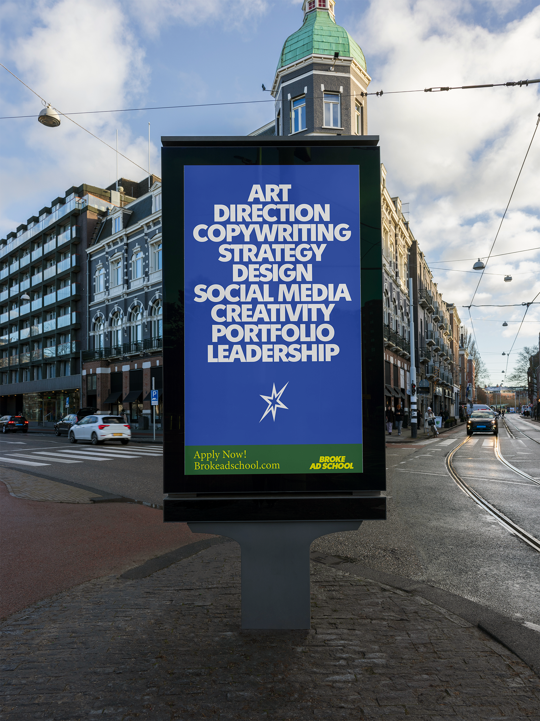
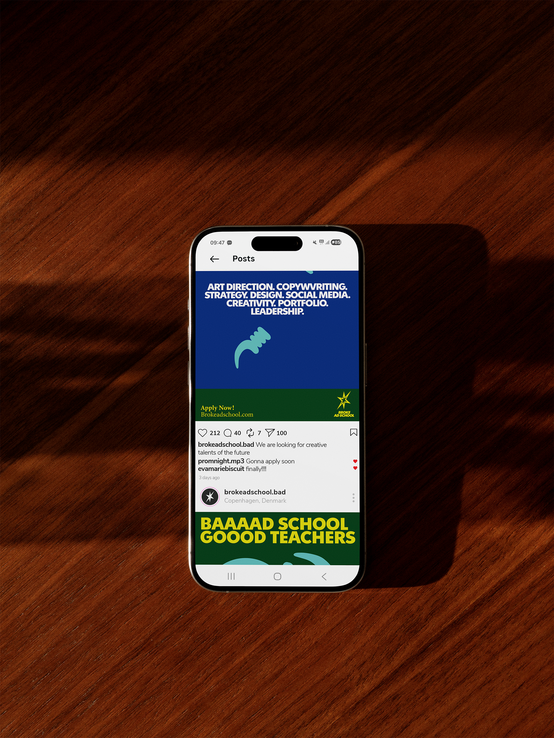
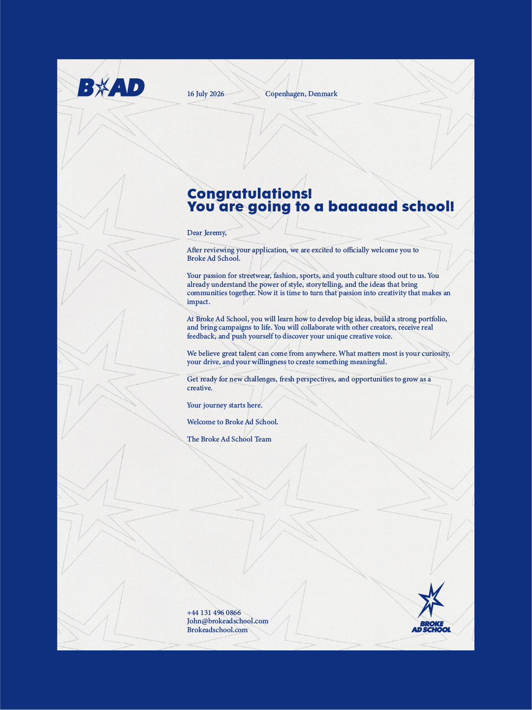
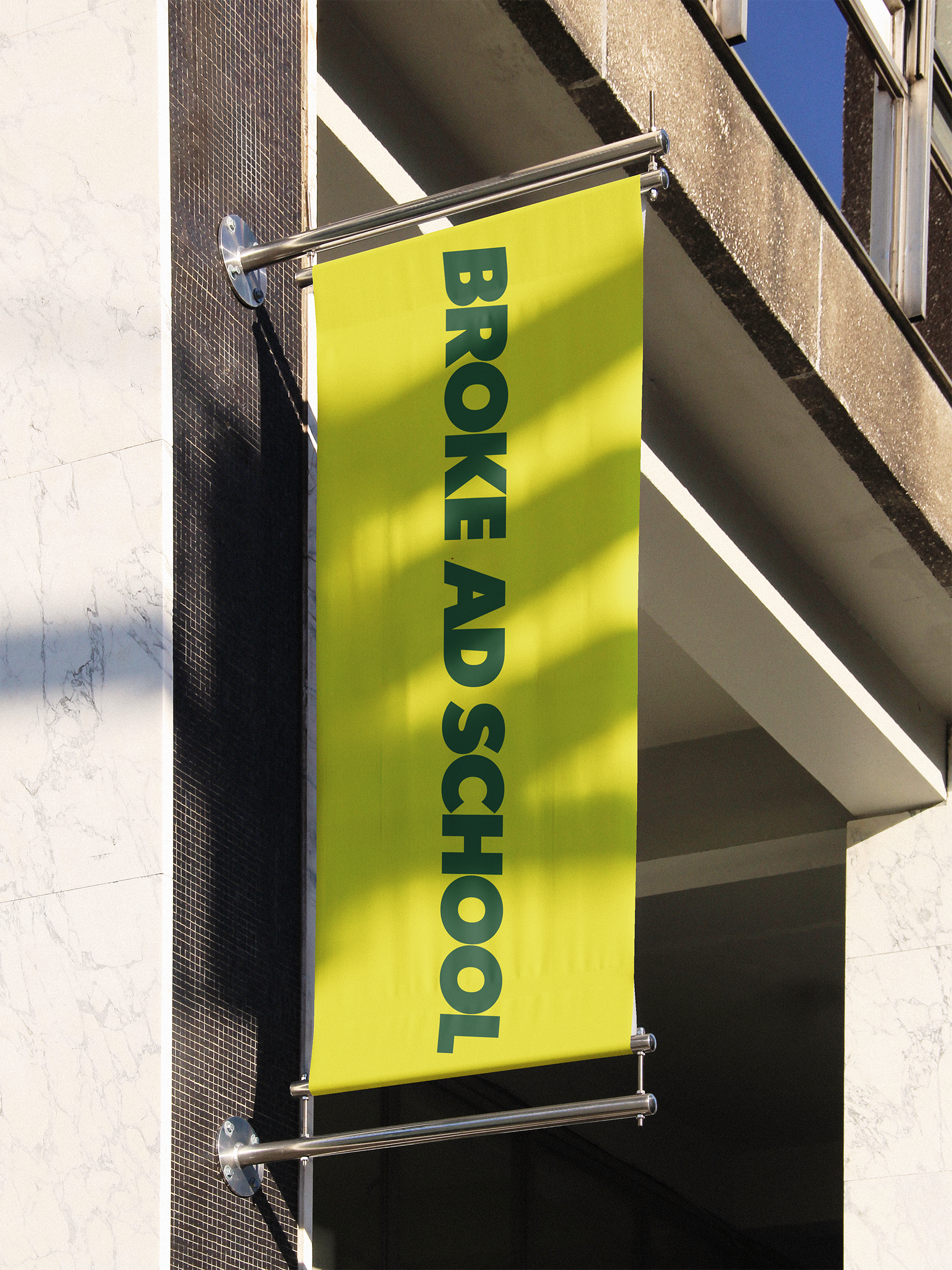
The color palette is energetic and vibrant, designed to resonate with younger audiences. This is supported by a visual style that aims to empower students and celebrate their cultural heritage and identity, showcasing a sense of pride in where they come from.
BROKE AD SCHOOL
Year: 2026
CLIENT
Broke Ad School
Services
Logo Design
Visual Identity
Photo direction
Digital Design

LOGO
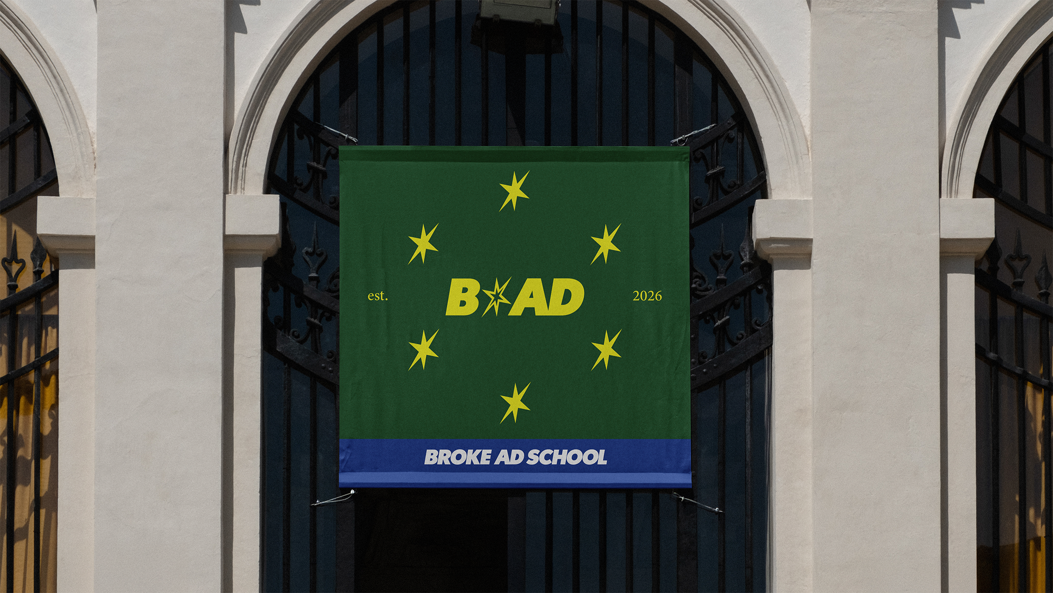
Stars appear on many national flags. Many flags of developing countries have one or multiple stars on their flags, more specifically, 58 national flags of developing countries have one or multiple stars on it. A Star is a strong symbol of independence and secession from oppression and control which is a deep-lying theme in most national identities of developing countries, and a cause of diaspora of over the last more than 200 years. These events have had a significant impact on today's youth from or originating from developing countries.
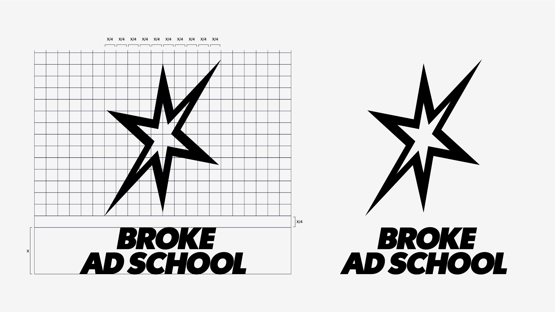
This is why a star is chosen as the new logo mark. It is 6-pointed and here is the why: Firstly, each point represents the 6 continents in which there are developing countries, tapping directly into the purpose of Broke Ad School. Secondly, a vast majority of stars used as logo marks for other brands are conventional 5-pointed versions, so the chosen 6-pointed one stands out more in itself. Utilizing 'The Golden Ratio' and the white space in middle, a smaller star is created, seemingly showing a bigger star around it. This is done to symbolize growth as Broke Ad School is where the youth grows, both educationally and personally. Finally, the star is tilted in the angle of the earth, 23,5 degrees, as a reference to our world which consists of contents, and then consists of countries - many of them developing countries.



IMAGERY
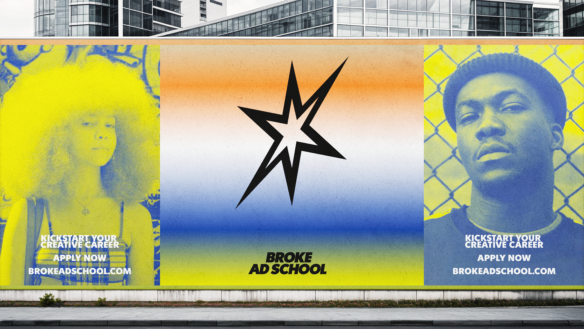
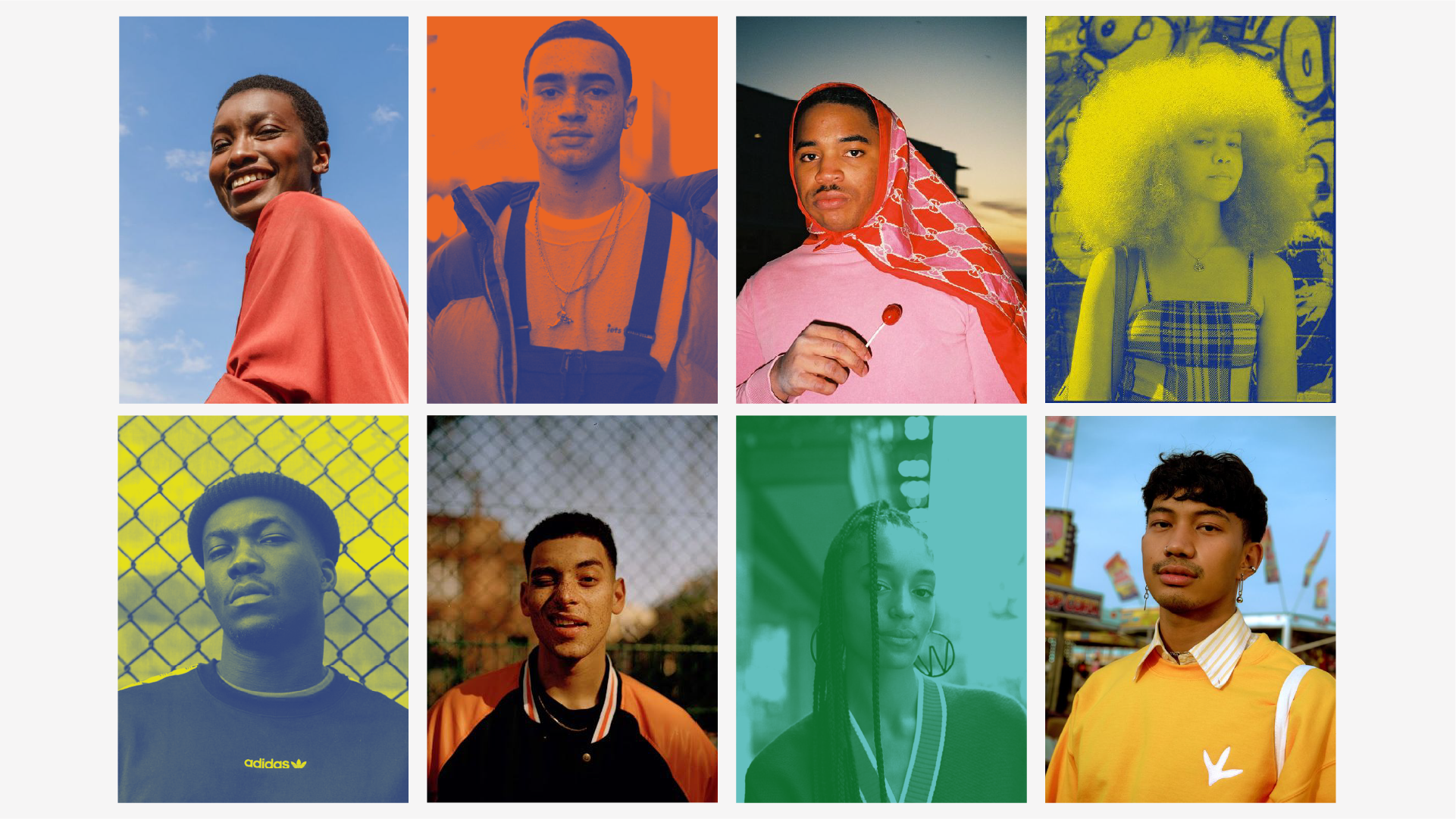
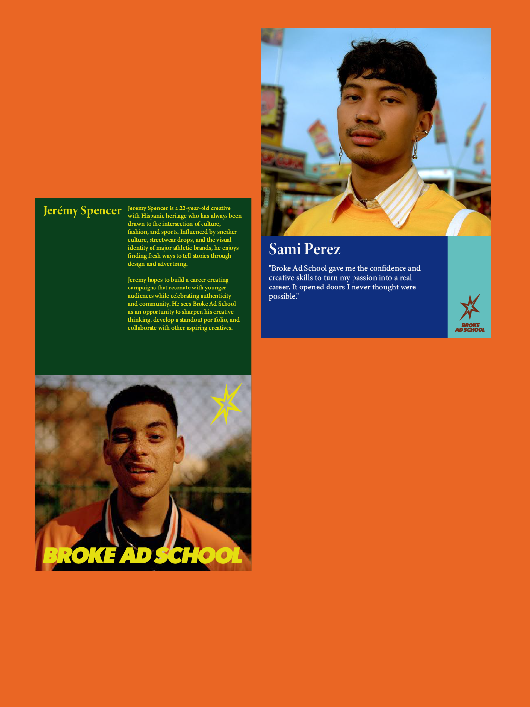
The imagery celebrates the talented, creative young people who make up the Broke Ad School community. Every image is designed to capture their confidence, individuality, and cultural identity in a bold, authentic, and empowering way.
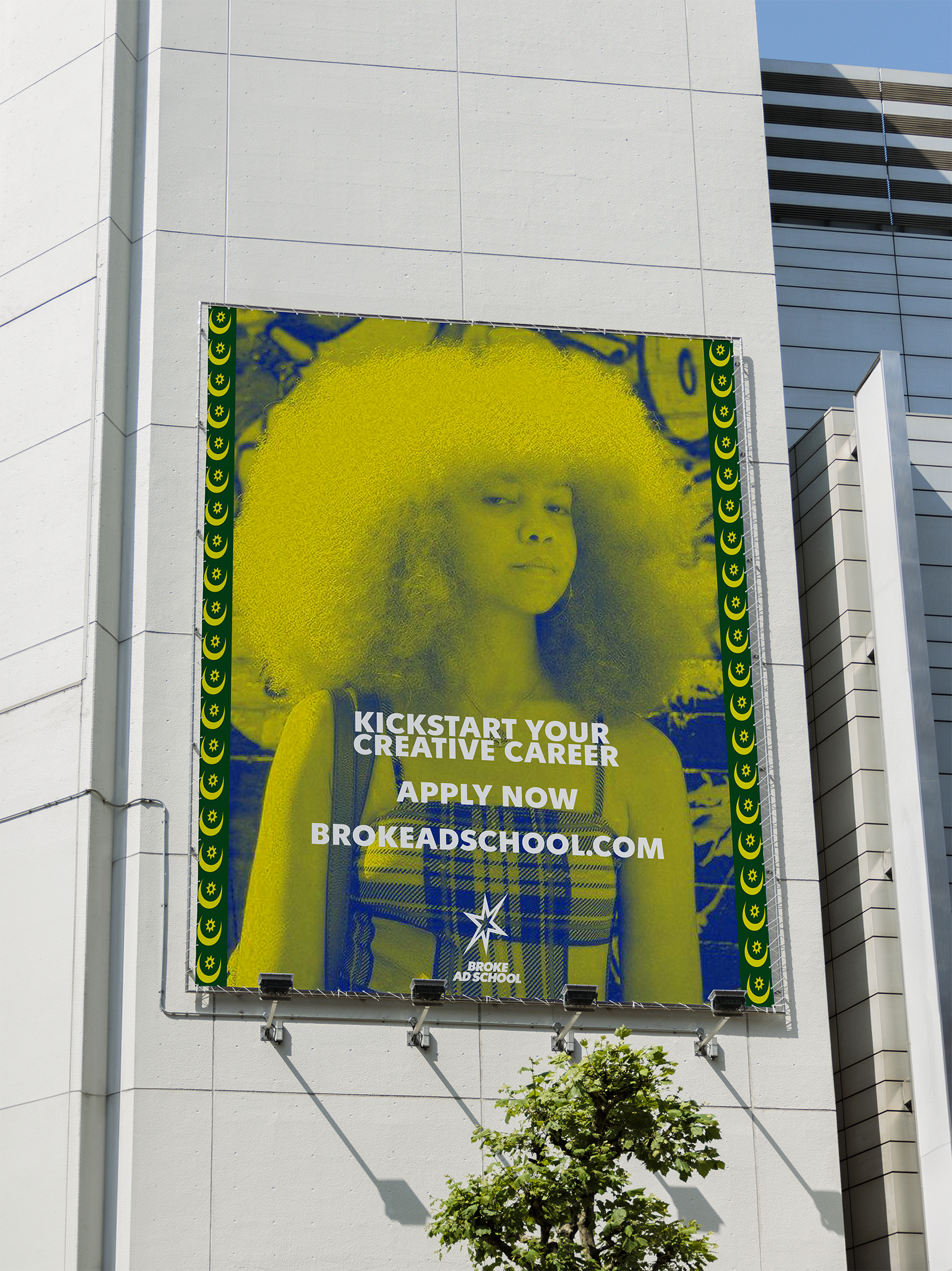
To further strengthen the brand identity, duotone treatments can be applied as a distinctive visual style across imagery. This stylistic approach reinforces the brand's creative expression while adding consistency, depth, and a bold, recognizable aesthetic to every image.

LAYOUT
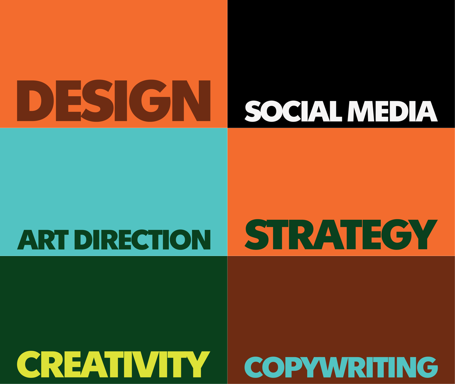
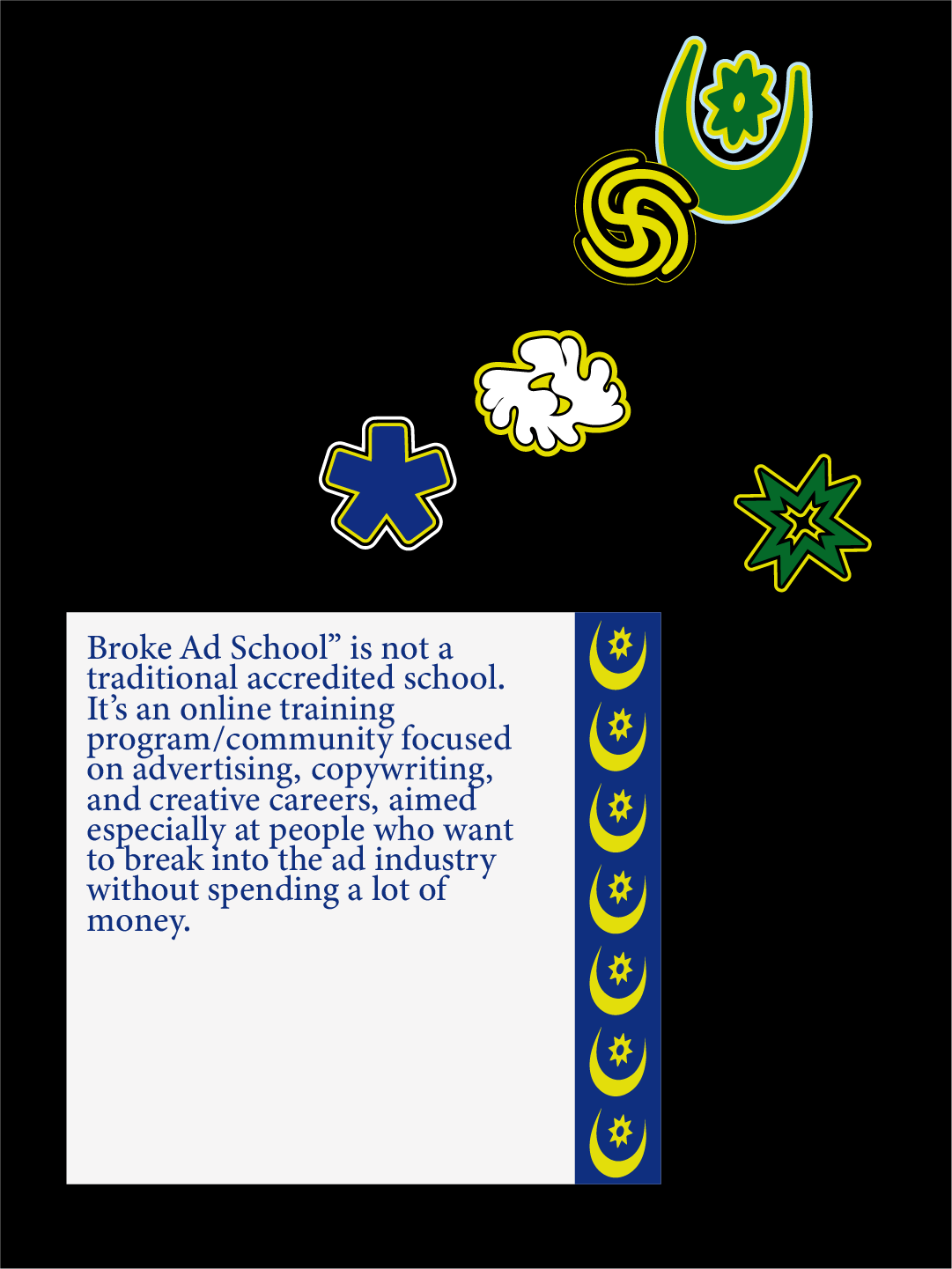
A layout where space are divided into sections allowing for dynamic graphic assets as a whole. It is about a functional layout where everything has its space without disturbing each other. Since the students are the main characters in the photography style, the layout makes sure to allow ample space for imagery while still mainting space for graphic elements and copy.

SYMBOLS
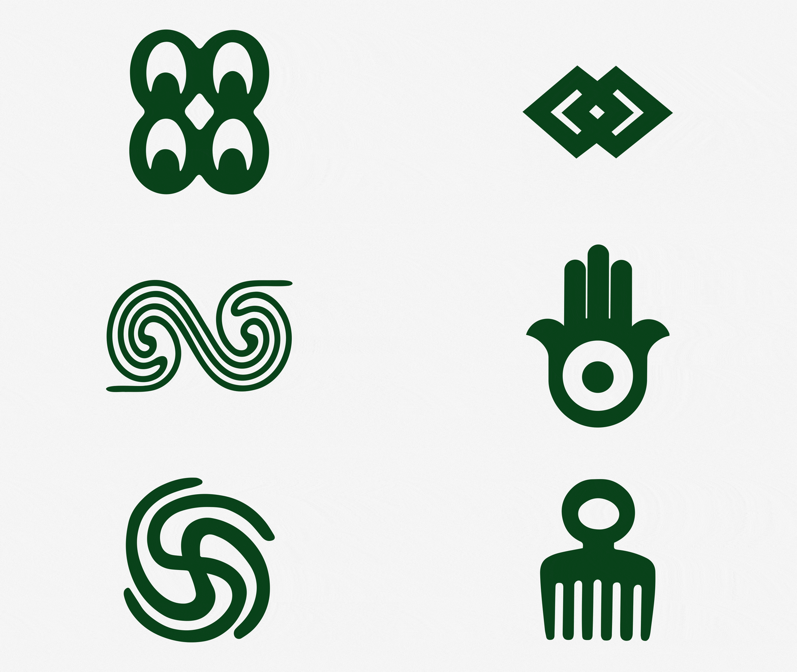
In cultures of developing countries across the world, symbols have been used to convey messages, express religous beliefs and to exert power and status. Symbols are an ancient form of communication and hold a significant cultural value and heritage in many developing countries, through Africa, The Middle East and South America etc. Many of these symbols are visually stunning and have been turned into design eleements to tap into the playfulness and youthful attitude of Broke Ad School while maintaing strong cultural connections.